Sustainability Report
21 January, 2026
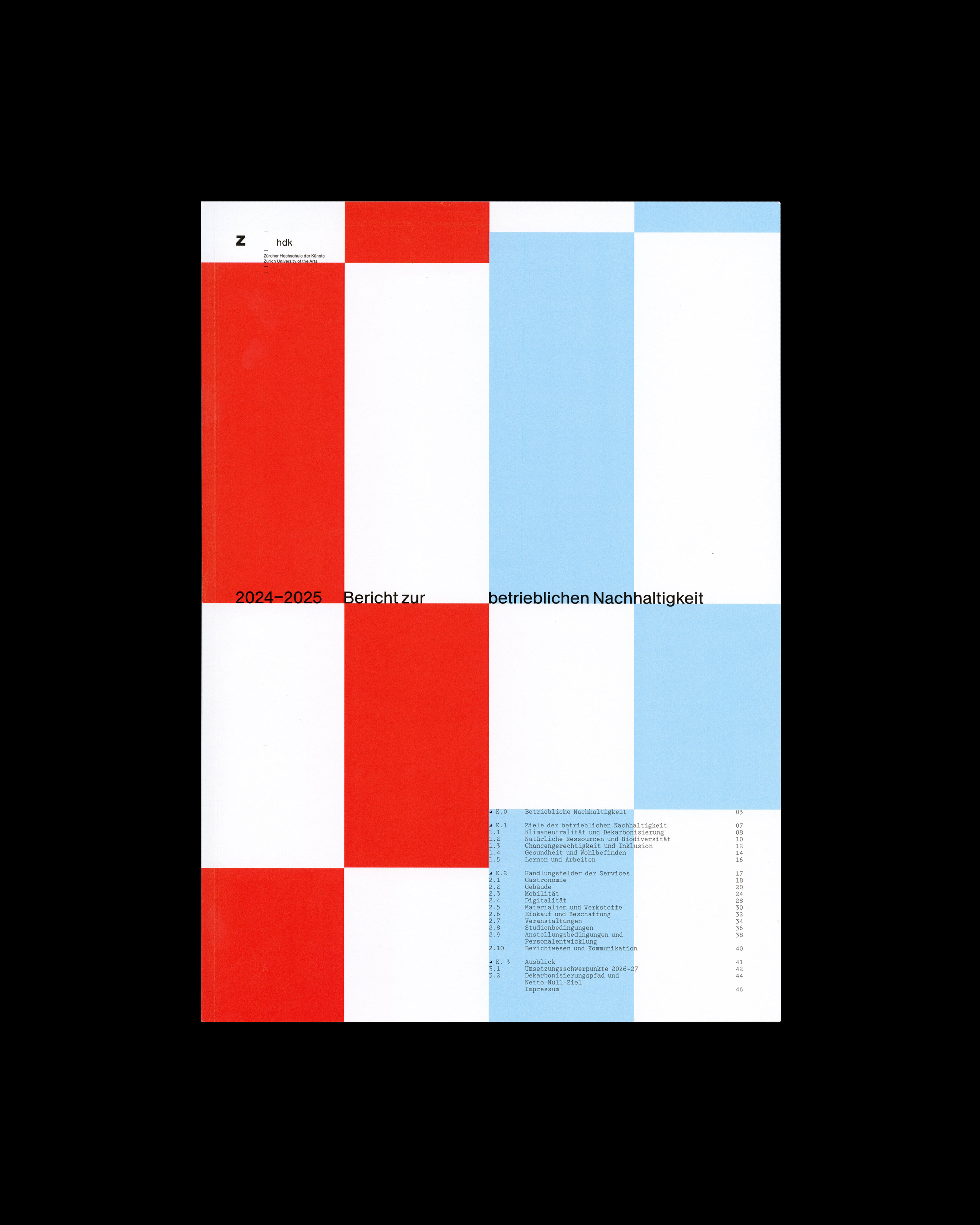
The ZHdK Sustainability Report 2024–2025 was developed in collaboration with Nico Frei. The report documents the university's efforts and progress in sustainability across various areas of operation and education.
When we began drafting the report in February 2026, we were tasked with designing it to serve as a complementary publication to the existing reports. It was intended to feel new and fresh, while at the same time appearing as a natural continuation of the two previous reports.
System
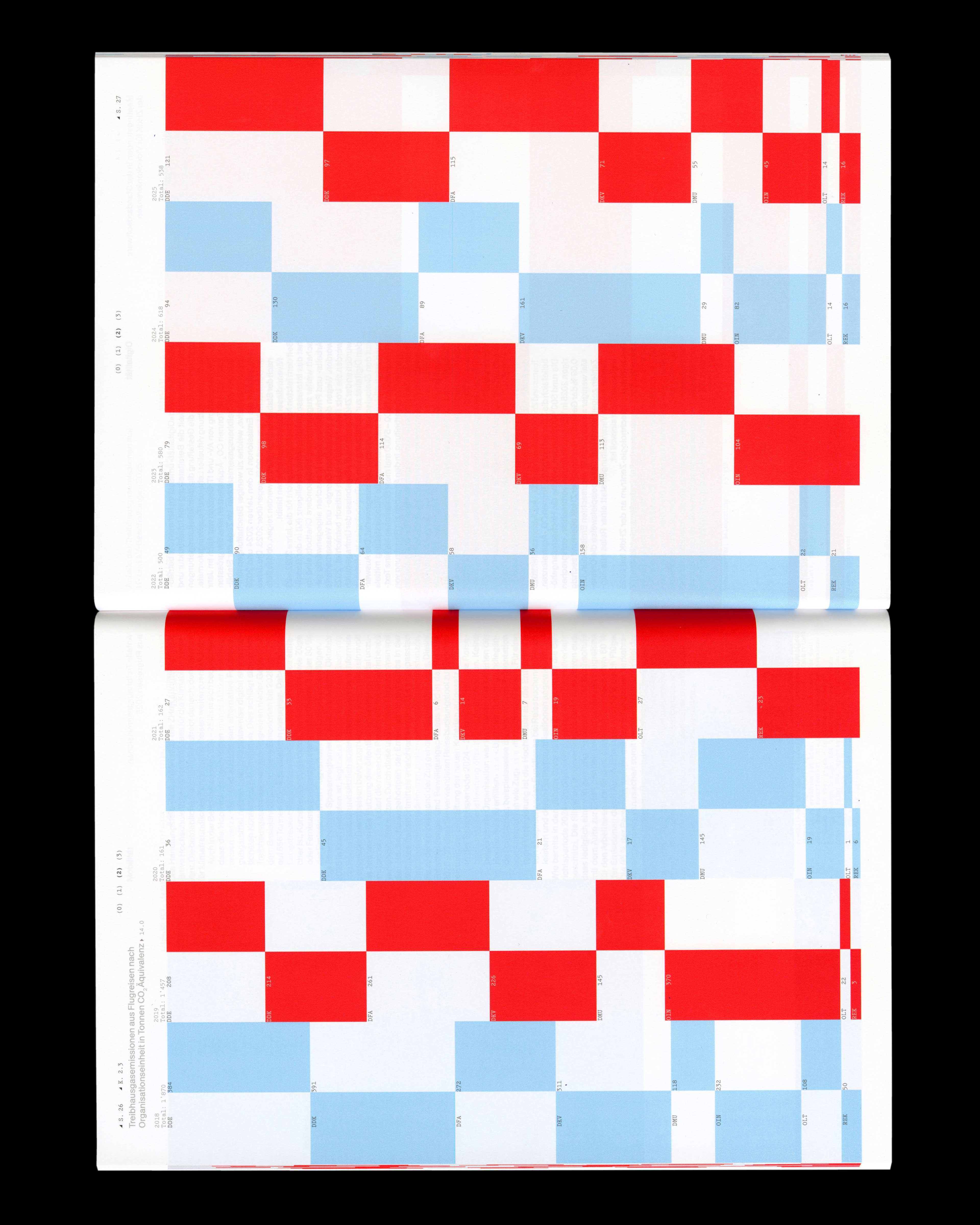
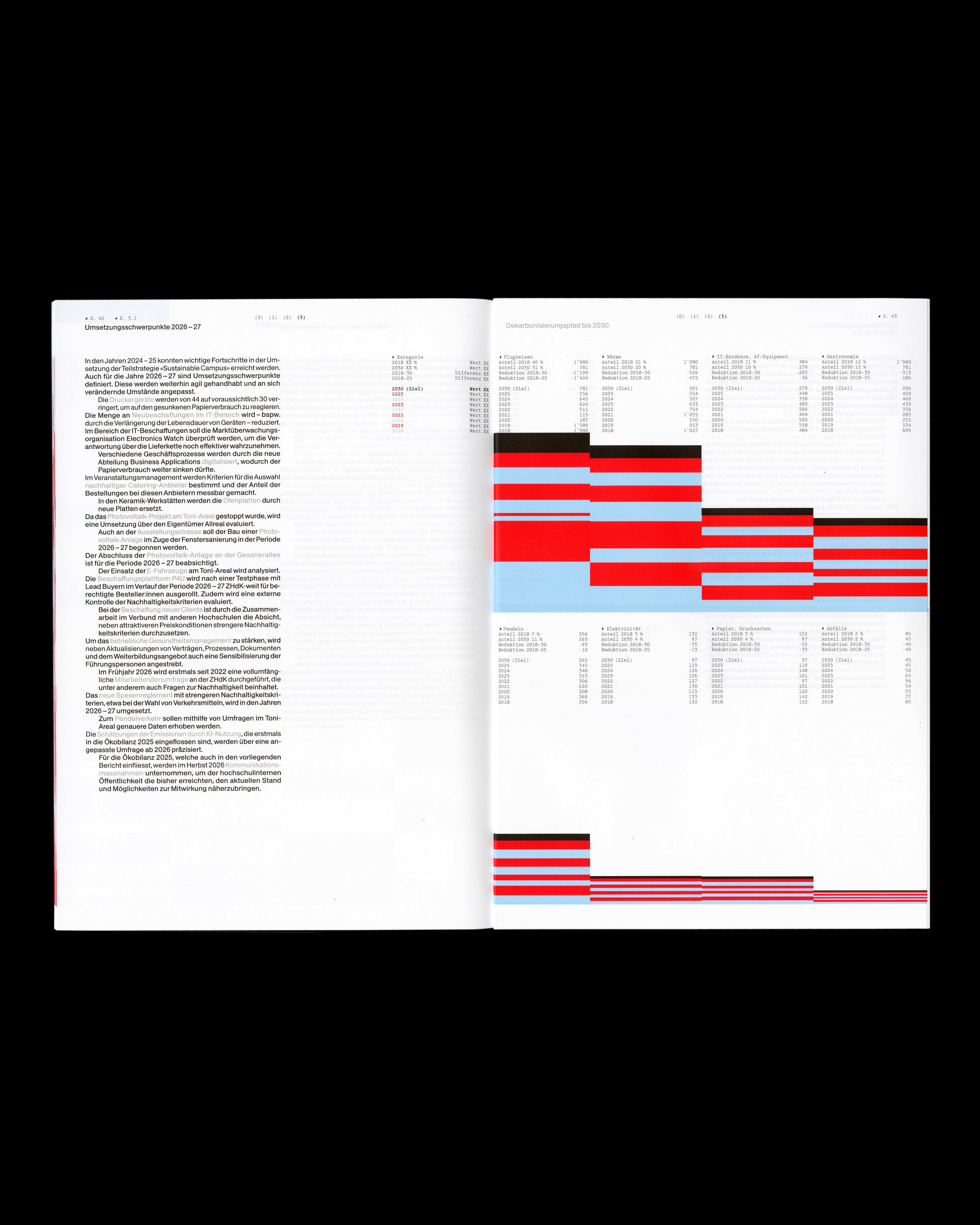
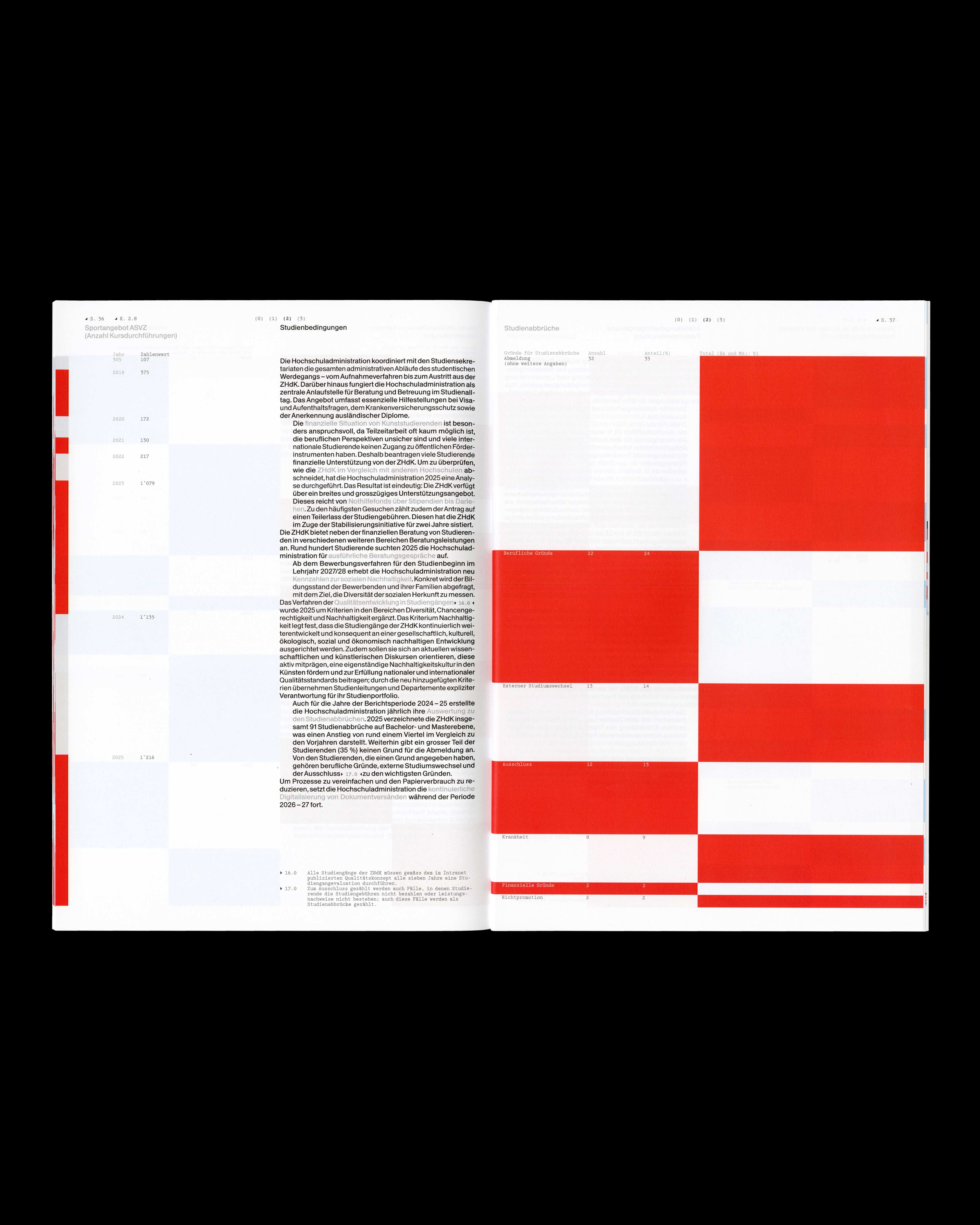
When we started, we established core values to guide the project. The report should be clear, easy to read, and visually engaging. We translated these values into a simple and consistent system that allows for varied page types.
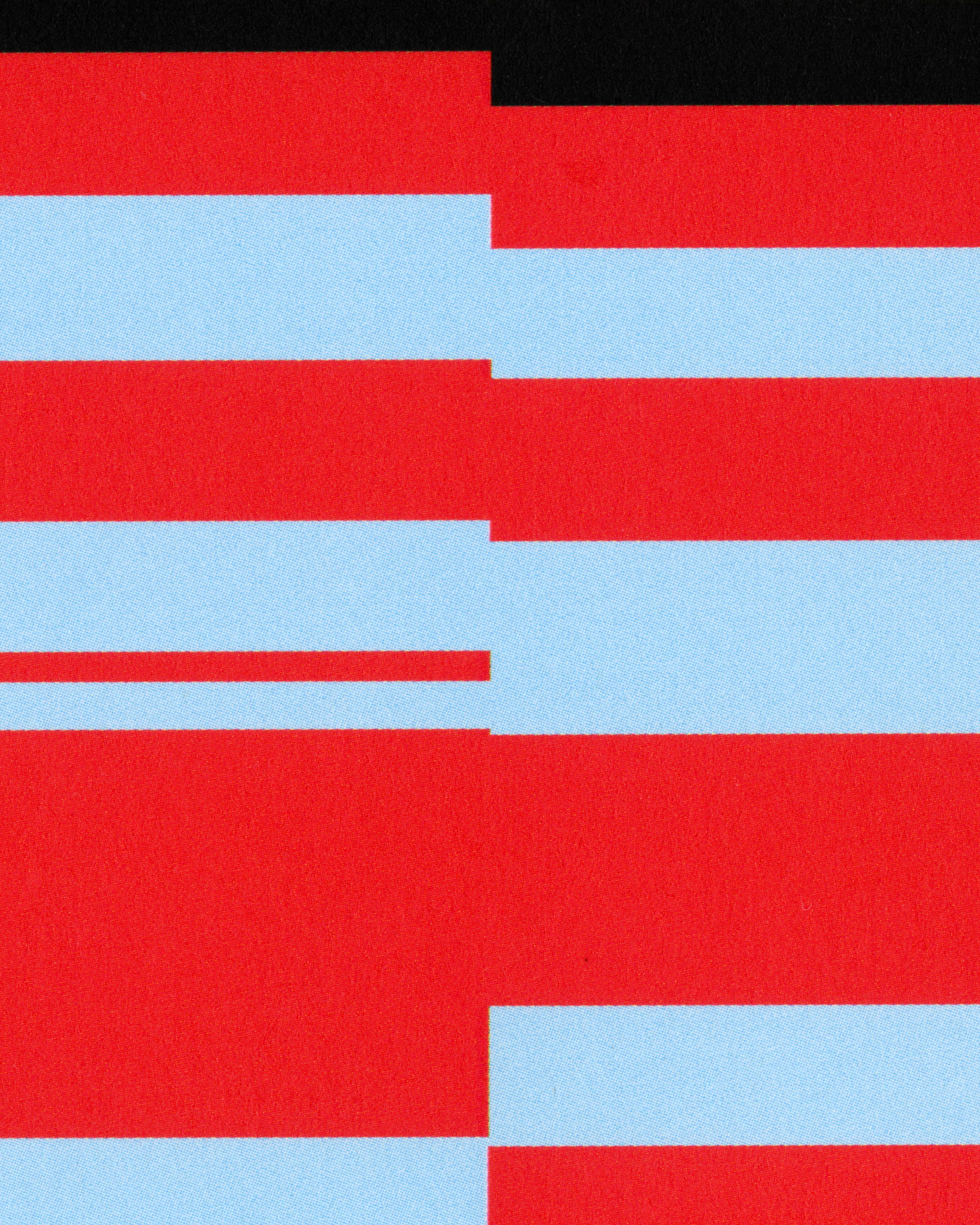
Each coloured area represents the value of a specific topic, with all areas on a page adding up to 100%. Pages can contain one, two, or four columns, depending on whether the topic is divided into different categories or years. This creates visual variety while keeping the information easy to understand.
Typography
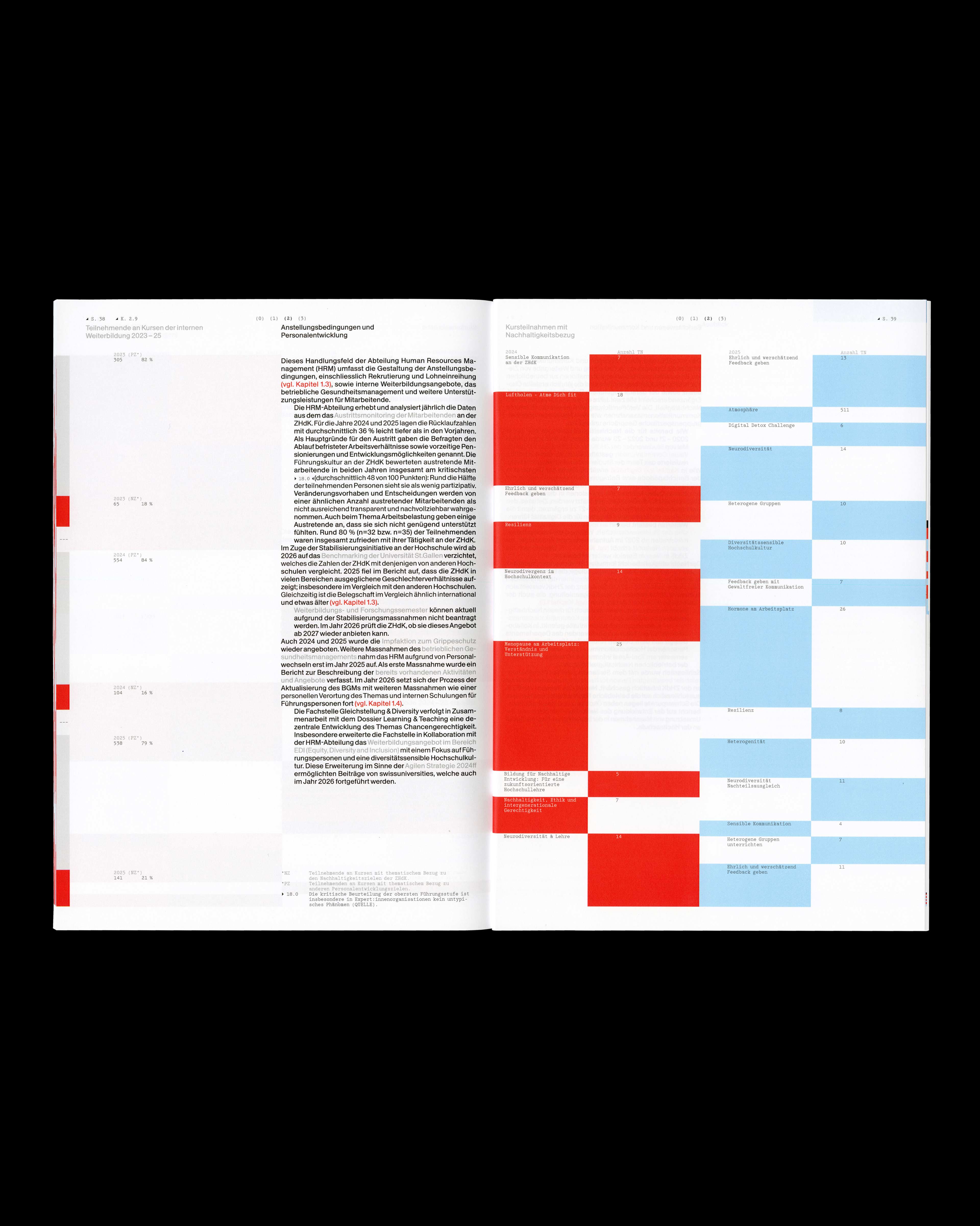
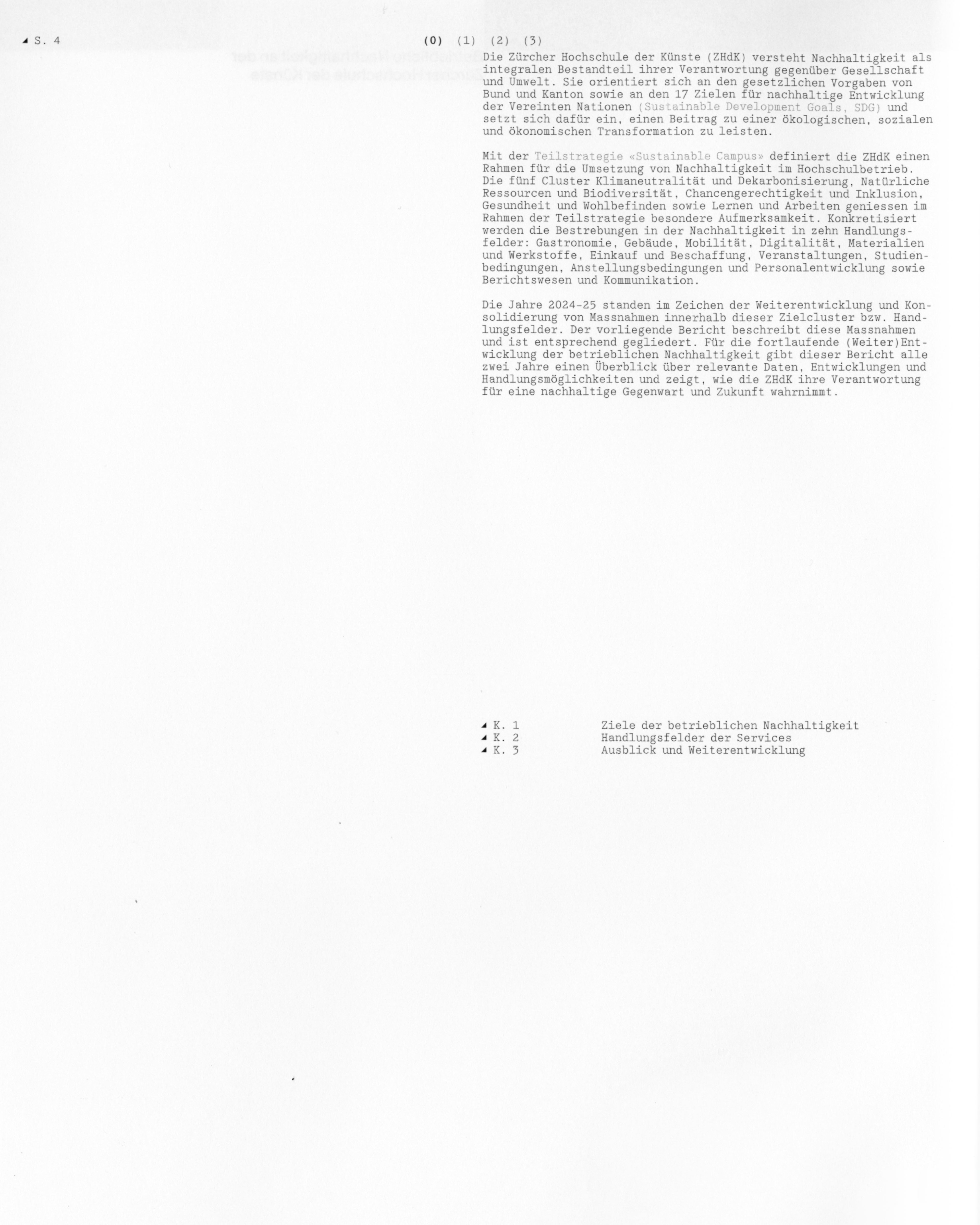
For body text and headlines, we used Antique Legacy by Optimo. For all numbers and technical details, we relied on Arketa by Outline-Online. When it came to questions of microtypography, we always referred to the Typolexikon1.
Arketa is an interplay between TextEdit® and a classic Typewriter, suitable to be applied for texts in print or on screens. This font was a perfect fit for our project, and by choosing this particular monospace, we were able to bring the technical narrative even more into focus.
Recognizability
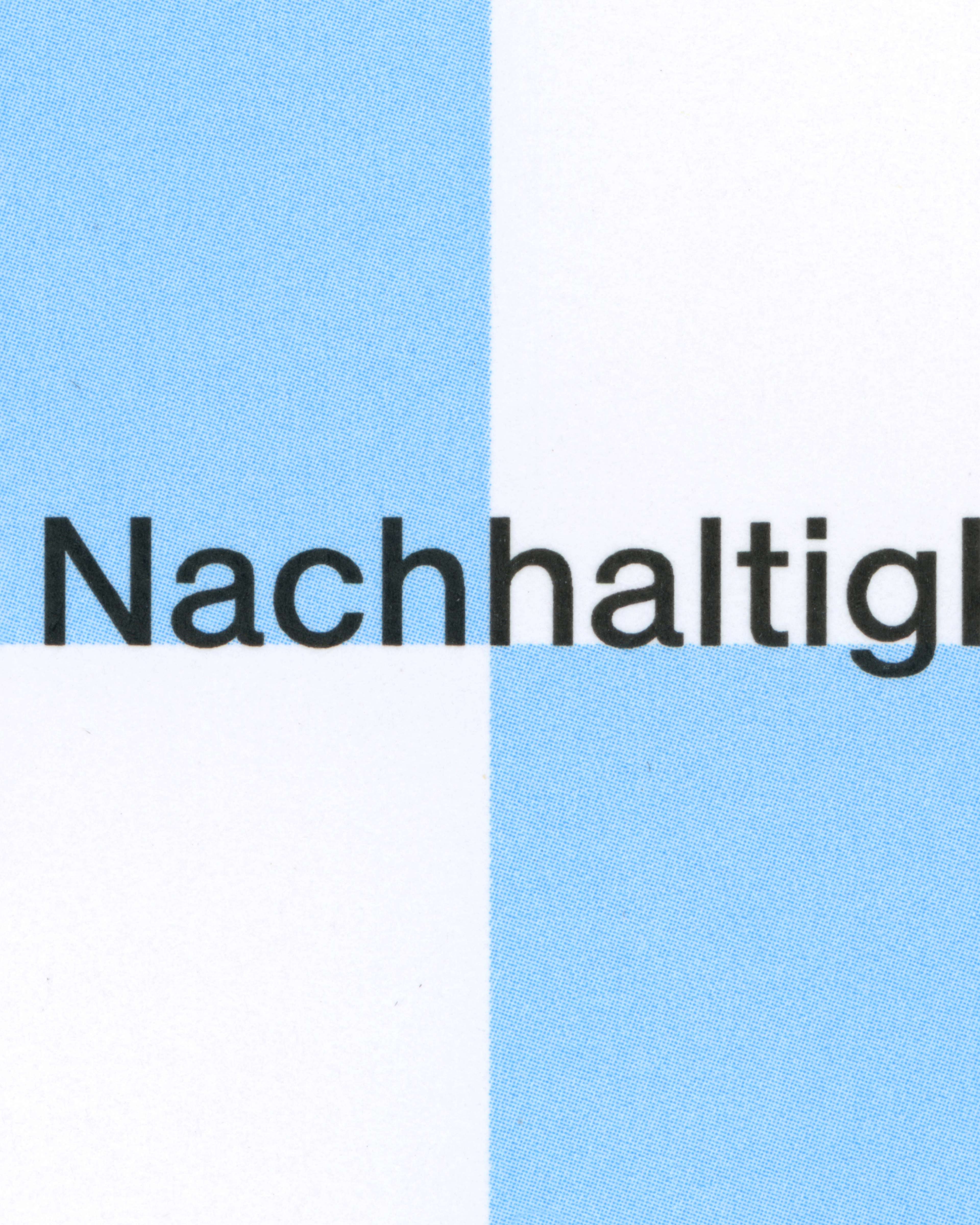
While analyzing the other reports, we noticed the interplay between typography and graphics. The way these two elements interact is a unique feature of this publication series. There are points of contact, overlaps... the two elements are in constant dialogue. We wanted to take this approach even further in our report.
To set ourselves apart from the others, we decided to adopt an even more technical narrative. We achieved this primarily through our choice of typography.
Reflections
We benefited enormously from the rules and constraints we defined at the very beginning, as they gave us a clear framework to build upon while still leaving enough room for experimentation. Looking back, those early decisions became the foundation that allowed the project to evolve in a structured and consistent way.
I also genuinely enjoyed working on a project that resulted in an analogue medium, even though I naturally gravitate towards digital design. It was incredibly rewarding to translate the precision and attention to detail I developed through digital design into a physical product.
The Typolexikon is one of the best websites for looking up typographic questions and has been an immense help to us time and again throughout the process.